Decorations & Tablescapes9 min read
Beautiful Tablescape Layers That Instantly Elevate Any Celebration
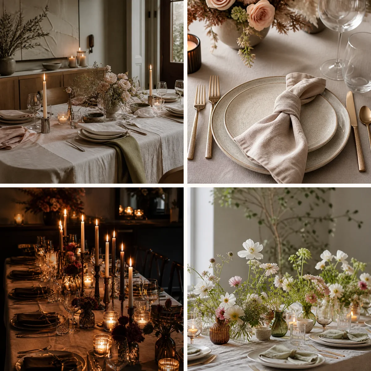
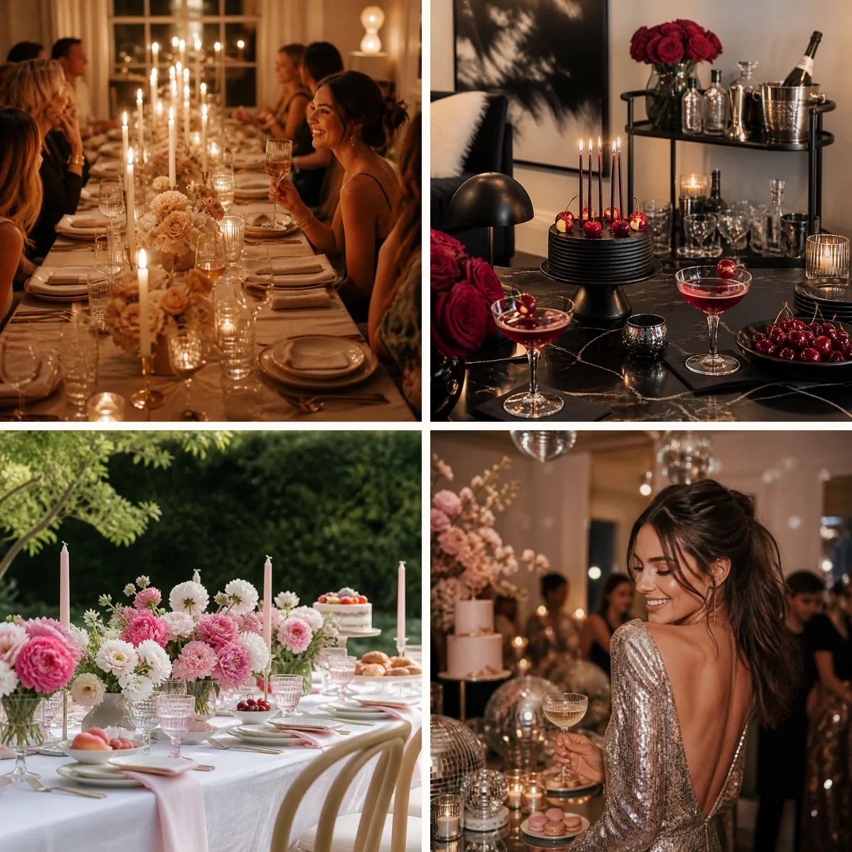
A memorable party table rarely depends on one expensive centerpiece or a perfectly matched set. What makes it feel special is layering: the quiet build of texture, color, height, and light that turns a basic setup into something warm, intentional, and celebratory. When runners, chargers, napkins, glassware, florals, and candles are chosen to support one another, the whole table looks polished without feeling stiff. The good news is that layered styling is practical, not mysterious. A few smart decisions about scale, spacing, and contrast can make even simple pieces feel elevated. The ideas below break the process into manageable parts so you can create a cohesive table for birthdays, showers, dinner parties, holidays, or any gathering that deserves a little extra beauty.

Start With a Runner That Sets the Mood
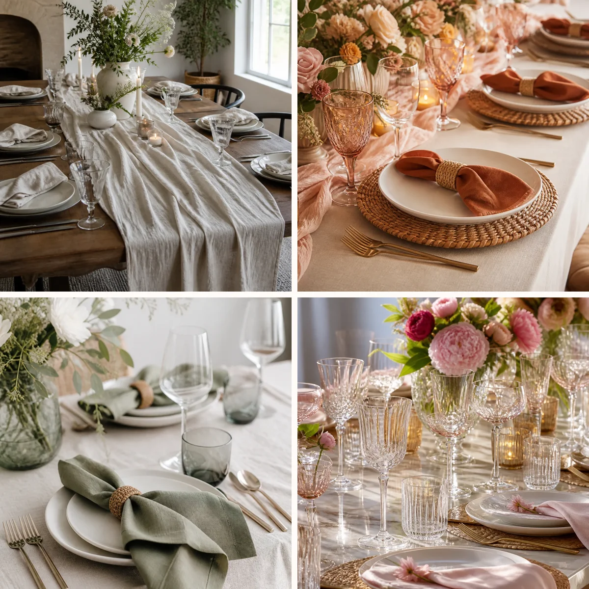
A runner is often the first layer that tells guests what kind of celebration they are walking into. Linen in a soft neutral creates an easy, collected look, while velvet, gauze, or a subtle pattern adds more drama and movement. If your table is busy or rustic, a solid runner helps calm the surface. If your table is plain, a textured runner can add depth before anything else is placed. Aim for enough length that it drapes naturally off each end, unless you want a cleaner modern finish with the runner stopping short. Think of the runner as a bridge between the table and the centerpiece. It should support, not compete with, the plates and flowers. If you plan to use colorful florals or patterned napkins, keep the runner quieter. If the rest of the table will be simple white dishes and clear glassware, the runner can carry more personality through color or weave. This opening layer makes every other decision easier because it establishes the table’s visual rhythm.

Anchor Each Place Setting With Chargers
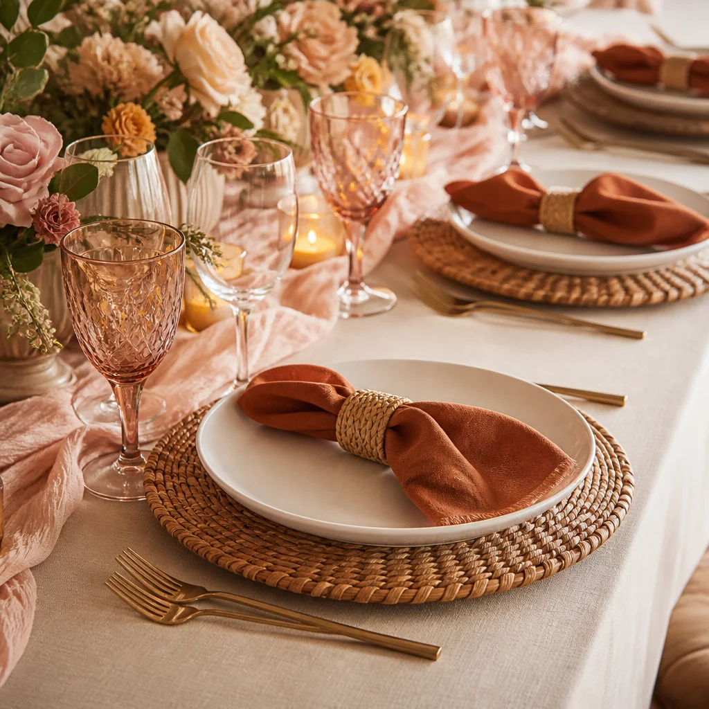
Chargers instantly make a place setting feel more complete because they create a generous frame beneath the dinner plate. They also introduce a second material, which is what gives a table that layered, designer look. Woven rattan chargers feel relaxed and charming for garden lunches or casual celebrations, while metallic, lacquered, or stone-look versions bring more formality to evening events. Even when dinner plates are simple, a charger adds weight and intention. For the best effect, let the charger contrast gently with both the table and the plate. White plates on a warm wood-toned charger feel dimensional; cream stoneware on a brushed gold charger feels dressier but still inviting. Keep the charger large enough to define the setting but not so large that guests feel crowded. When all the place settings are evenly spaced, chargers create structure across the whole table and make the rest of the styling feel polished.
Use Napkins to Introduce Softness and Color
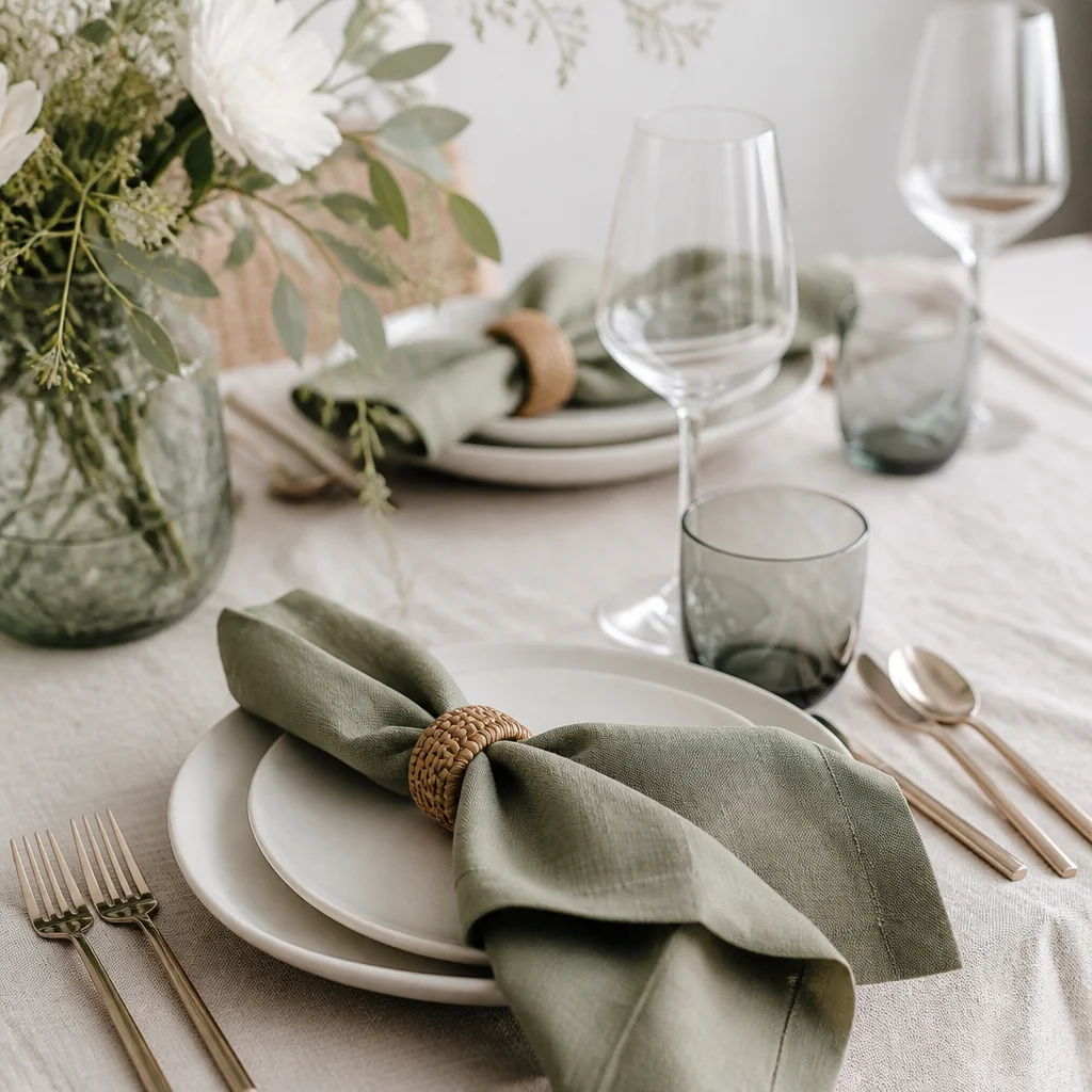
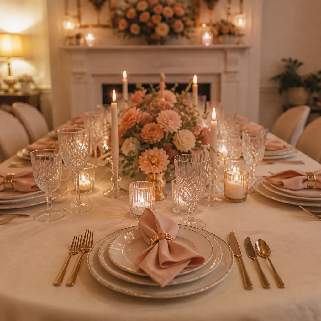
Napkins are one of the easiest ways to add softness because they bring fabric into the place setting itself. A crisp white napkin folded neatly looks classic and tailored, while a loosely knotted linen napkin feels relaxed and celebratory. This is also a smart place to introduce accent color. Dusty blue, olive, terracotta, blush, or deep plum can echo the flowers or candlelight without overwhelming the table. To keep napkins looking intentional, repeat their color somewhere else on the table, even subtly. That could mean a bloom in the centerpiece, a tinted goblet, or a ribbon around menus or favors. If your runner has visible texture, choose napkins with a smoother finish for balance. If your plates and chargers are sleek, a naturally rumpled linen napkin adds welcome contrast. Small details like a simple fold, a napkin ring, or a sprig of greenery can make each setting feel considered without becoming fussy.
Mix Glassware With Purpose, Not Clutter
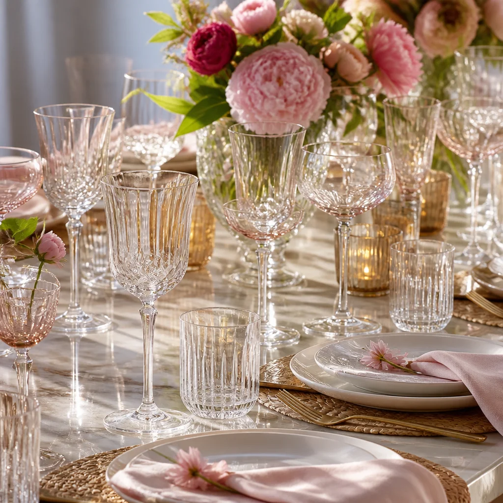
Beautiful glassware adds sparkle, but too many shapes can make a table feel crowded. The trick is to choose one or two styles that relate to the tone of the party. Clear stemware keeps things airy and lets other layers shine, while colored goblets can act almost like jewelry for the table. Ribbed or etched glass catches candlelight beautifully and adds elegance without demanding attention. Place glassware where it feels functional and balanced rather than decorative for its own sake. Typically, one water glass and one wine or coupe glass is enough for most celebrations. If you use colored glass, repeat that tone down the table instead of alternating many shades. A consistent glass story helps the table feel cohesive. Leaving a little breathing room around each setting is what allows glassware to look graceful rather than busy.
Build Centerpieces in Low, Gathered Layers
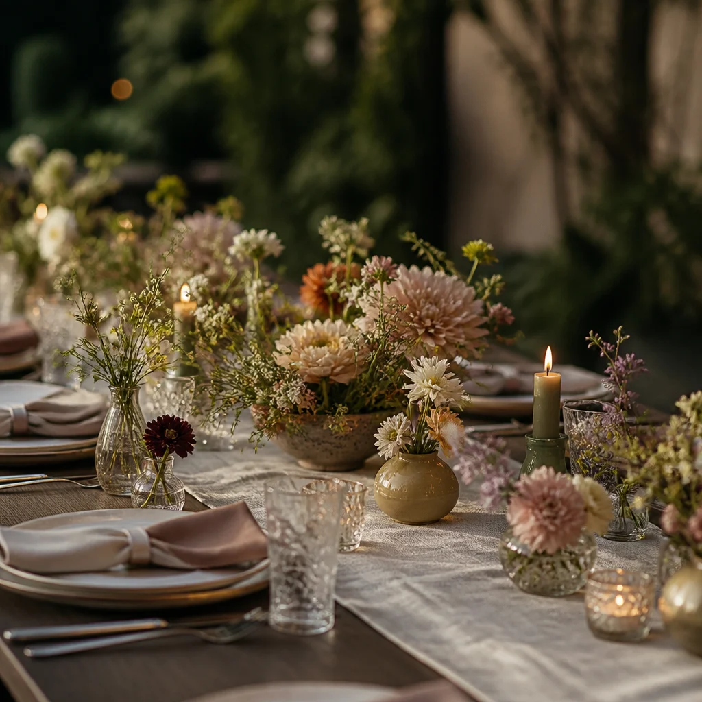
Florals do not need to be tall or elaborate to make an impact. In fact, low arrangements are often more inviting because guests can see one another easily across the table. Instead of one oversized centerpiece, try several smaller vessels spaced along the runner. Bud vases, compotes, and low bowls filled with blooms and a little greenery create movement and make the whole table feel abundant. Use flowers in a restrained palette so the table reads as cohesive. You might combine cream blooms with touches of green for a fresh look, or layer peach, rust, and soft pink for warmth. Vary the shapes of the flowers, not just the color, to keep arrangements interesting. A cloudlike bloom next to something spiky or delicate gives the arrangement depth. When floral pieces are kept low and repeated in rhythm, they become a unifying layer rather than an obstacle.
Add Candlelight at More Than One Height
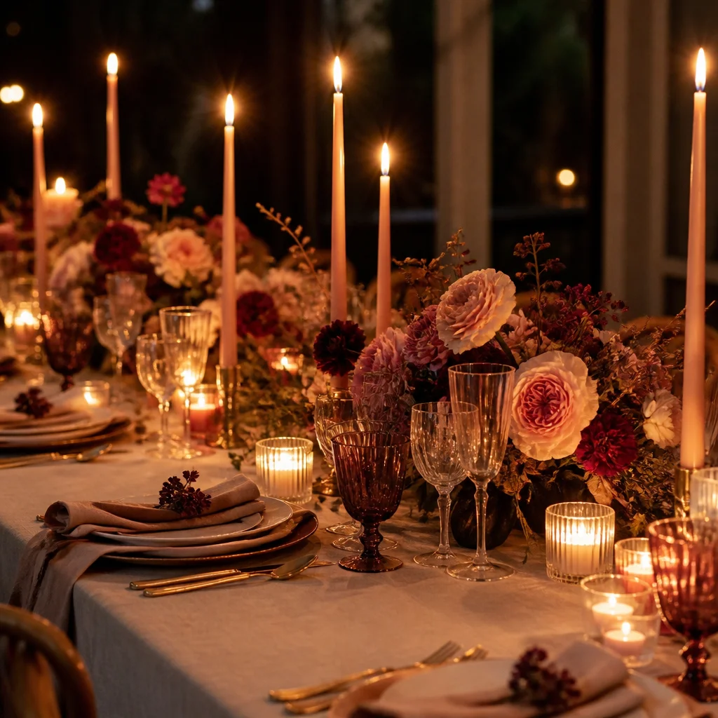
Candlelight is what often turns a pretty table into an unforgettable one. It softens edges, flatters every material, and makes even simple place settings feel intimate. The most effective candle styling uses more than one height. Tall tapers in slim holders bring elegance and verticality, while low votives or tealights fill in the glow closer to the tabletop. This mix creates depth and prevents the center of the table from feeling flat. Keep the candle colors in conversation with the rest of the palette. Ivory is always versatile, but soft blush, olive, taupe, or deep burgundy can look beautiful when used with restraint. Space flames so they feel intentional and safe, and avoid placing them so close to flowers or napkins that the table becomes visually tense. Even a modest arrangement of candlelight can transform the mood if the heights are varied and the placement feels balanced.
Create Cohesion With a Tight Color Story
One reason some tables feel instantly elevated is that the colors are edited. Rather than using every lovely item you own, choose a focused palette and let it repeat in different materials. A reliable formula is one dominant neutral, one supporting color, and one accent. For example, you might use ivory as the base, sage as the supporting tone, and touches of brass or amber as the accent. That kind of restraint makes a table feel designed instead of improvised. Color cohesion does not mean everything must match. In fact, slight variation makes a table feel richer. Cream, sand, and oatmeal can live together beautifully, just as different shades of green can. The goal is for the eye to move easily from runner to napkin to florals to glassware without any one piece looking accidental. If something stands out too sharply, repeat it once more or swap it for a softer tone so the palette feels complete.
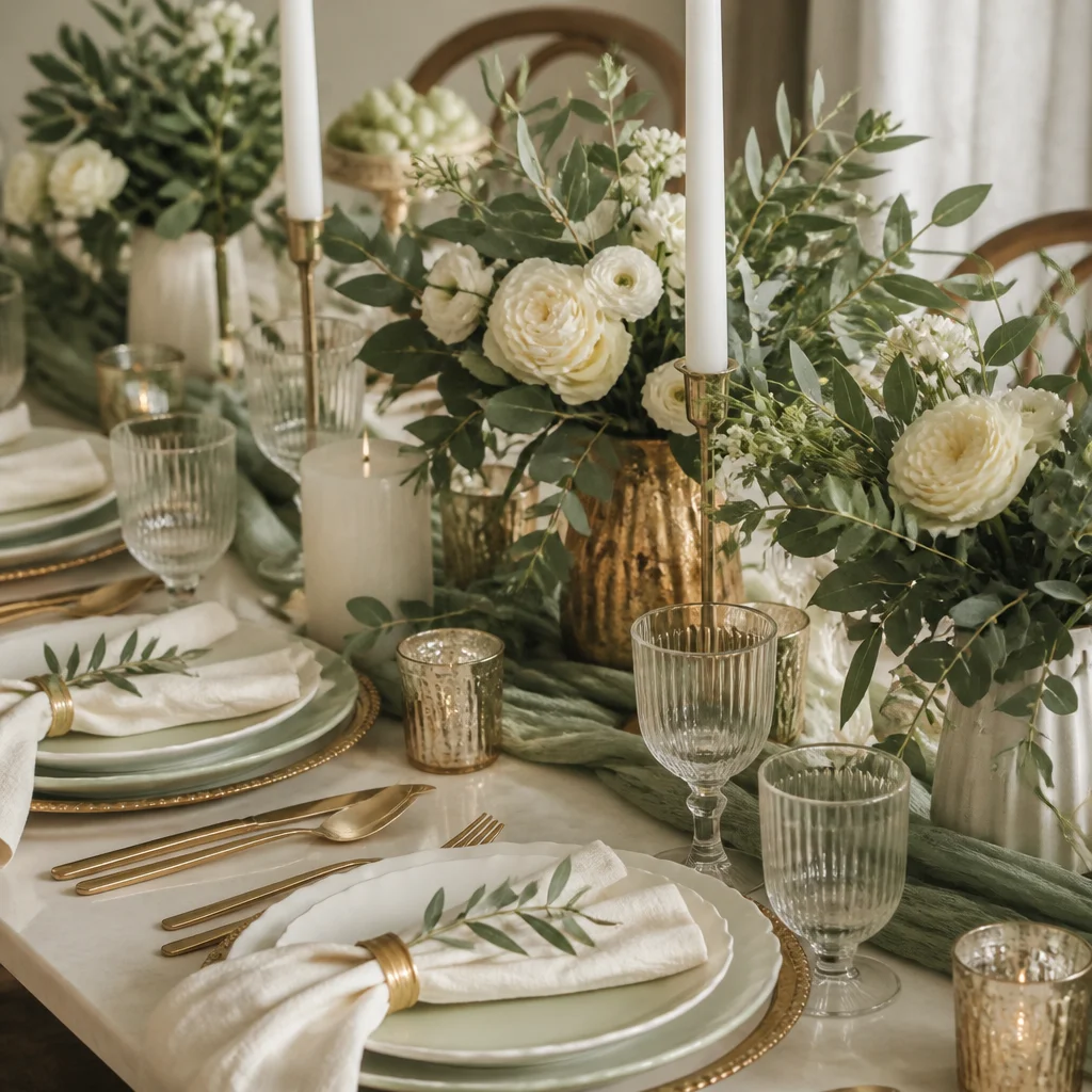
Balance Texture So the Table Feels Rich
Texture is often the layer that makes a tablescape feel expensive, even when the pieces are simple. Smooth ceramic plates, a slubby linen runner, woven chargers, polished flatware, and delicate glass all contribute different tactile qualities. When these textures are combined thoughtfully, the table feels collected and dimensional. If everything is glossy and hard, the setup can feel cold. If everything is rustic and matte, it may lack definition. Aim for a mix of at least three distinct textures across the table. A natural fiber charger under clean porcelain, paired with soft fabric napkins and gleaming candleholders, usually creates enough contrast to feel interesting. You can also use fruit, branches, or seasonal foliage to add organic texture without crowding the table. The secret is balance: every rough surface benefits from something smooth nearby, and every crisp element looks better next to something relaxed.
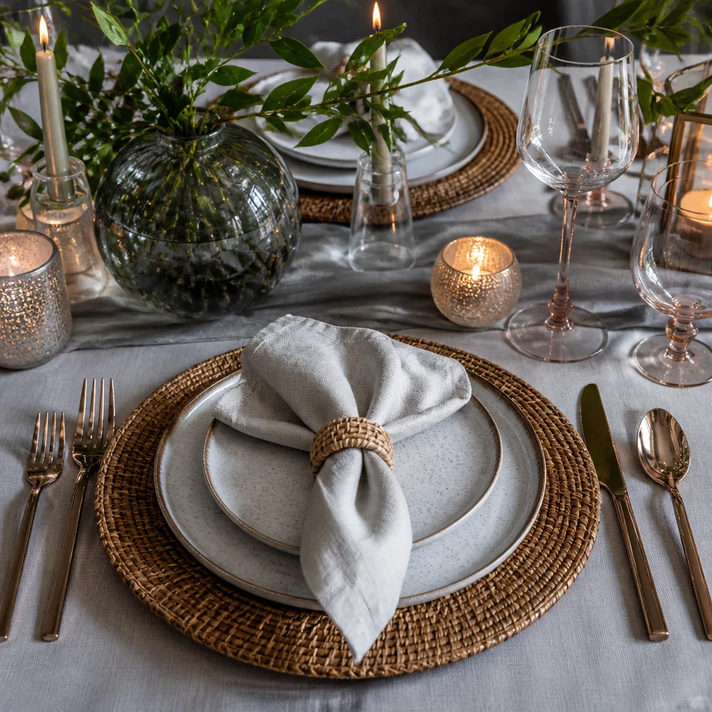
Leave Negative Space Around the Pretty Things
Layering works best when every element has room to be seen. One of the most common styling mistakes is overfilling the table with decorations until guests have nowhere to place a glass or rest their hands. Negative space is not emptiness; it is what gives the beautiful objects presence. Leaving a little open tabletop around each place setting makes chargers, napkins, and glassware look more intentional. As you style, step back and check whether the eye can rest. If florals, candles, and serving pieces all touch visually, remove one item or spread things farther apart. A centered runner with repeated arrangements often creates enough abundance without needing to cover every inch. This breathing room is especially important on smaller dining tables, where a few high-impact layers will always look more refined than many tiny accessories competing for attention.
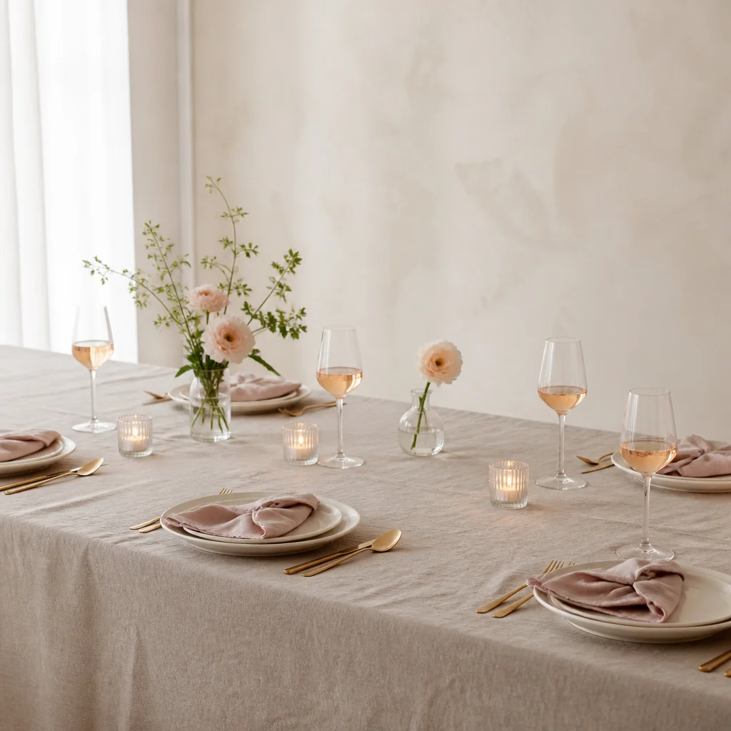
Use Seasonal Details as the Finishing Layer
Once the main layers are in place, a few seasonal touches can personalize the table without overwhelming it. In spring, that might mean flowering branches or pale tulips. Summer tables look lovely with citrus, herbs, or airy garden blooms. Autumn can welcome pears, figs, or foliage in warm tones, while winter often suits evergreen sprigs, darker candles, or a touch of velvet. These details help the table feel connected to the occasion and time of year. The key is to use seasonal elements as accents, not the entire design plan. Let them support your established palette and textures rather than introduce a completely separate theme. A bowl of fruit tucked between candles, a tiny sprig at each napkin, or a few branches added to low arrangements is often enough. Subtle seasonal references feel elegant because they enrich the story of the table without turning it into a prop.
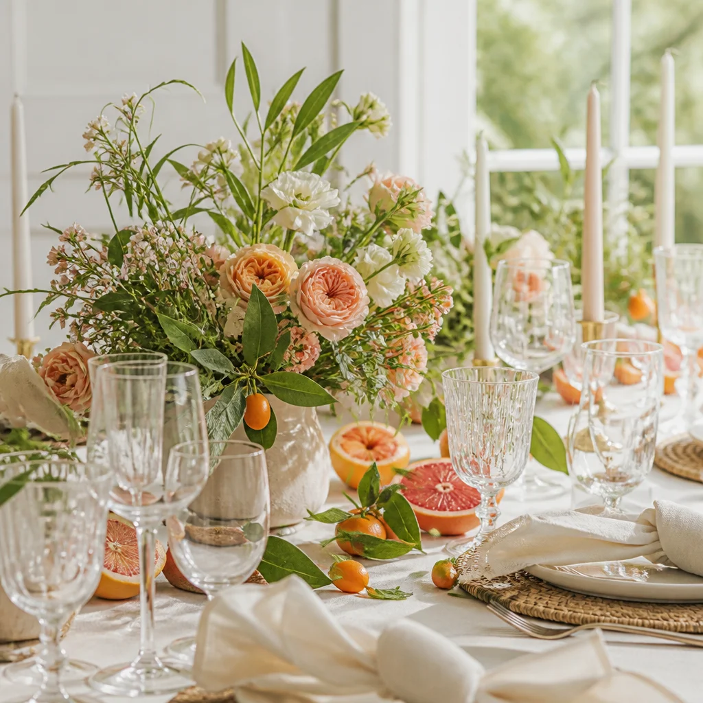
Finish With a Host’s Eye for Comfort and Flow
The most beautiful layered table is still meant to be used, so the final step is checking how it functions for real guests. Make sure each place setting has enough elbow room, glassware is easy to reach, and centerpieces do not block conversation. Candles should glow without dripping where people serve themselves, and napkins should sit where they can be picked up naturally. When a table works well, guests relax into it, and that ease becomes part of the beauty. Before the celebration starts, sit in one of the chairs and view the table from a guest’s perspective. You may notice a taper that is too tall, a floral cluster that needs shifting, or an empty spot that would benefit from one more votive. These small adjustments are what make a layered tablescape feel complete. The goal is not perfection but harmony: a table that looks special, feels welcoming, and invites people to linger a little longer.
Images are AI-generated inspiration concepts.
Explore the categories ↗